This month I’m spotlighting Marvelous Cornelius, the creation of Phil Bildner and John Parra, with a book giveaway!
****Goodreads Giveaway Details Below****
I love how the book joyfully celebrates the life of an extraordinary garbage man, working in New Orleans during Hurricane Katrina.
My son thought that Cornelius–the singing, dancing, and hooting garbage man–looked like a giant on the cover, which I think must have been intentional. I told him that anyone can seem like a giant if you look at them closely enough and it’s true. This is a wonderful story about an everyday hero who came to New Orleans’ rescue in its darkest hour, just by being himself!
Usually for a blog post I interview the artist or author, but Dionna Mann just hosted the most amazing six day blog party for Marvelous Cornelius, so I’m going to point you in that direction! When you are done reading all her marvelous interviews I know you will want to click the link below and enter to win one copy of Marvelous Cornelius, signed by the artist, on goodreads!
Today I’m interviewing Laurie Allen Klein, illustrator of THEY JUST KNOW, ANIMAL INSTINCTS. Her new book explores how some young animals just know what to do without any help. The book has all sorts of fun indulging the way kids THINK animals grow up… before setting them beautifully straight. And like all Arbordale books, the For Creative Minds section at the end of the book contains printable activities on animal instincts, learned behaviors, life cycles, and metamorphosis!
You can enter to win a copy of your own on Goodreads by clicking the book’s cover below!
Hi Laurie, it’s so exciting to interview you for the Nonfiction Nook! Usually when interviewing illustrators, I try to be a little more professional and removed, but since YOUR book is OUR book I feel like doing a little dance.
Hooray & welcome!!!!!!!!
The very first work of yours for the book I got to see was the fully sketched dummy as a pdf, and I was so pleased and excited. The way you go back and forth between humorous anthropomorphic and beautiful realistic spreads was EXACTLY what I had envisioned. Now, we never chatted while the book was being created, I never said (even to our editor), I want one spread to look like this and another to look like that, which is a fact nervous authors out there might appreciate. So, I wonder, how and when did you decide to give the book that visual rhythm?
Interestingly enough, when I first read the manuscript I had a whole different idea in mind, but to be fair, it was a real quick read. I was in the midst of finishing another book when I got the e-mail from Arbordale asking if I would be interested in illustrating your story, so I read it through to get the gist of the narrative and subject matter. The Basic theme was right up my alley in terms of subject matter so I quickly said yes, and then turned my attention back to the illustrations for the other book.
I knew, from that first quick read, that the book was naturalistic, depicting the different stages of development, and because most of the animals were relatively small (certainly their earliest phases were) I pictured the spreads being extreme close-up, with lots of realistic detail of each stage, while the background would be kind of blurry and out of focus. So that was the basic idea I had in mind, and the direction I intended to take.
Fast forward to several weeks later. I was giving a Book Talk to a 4th grade class. On this particular day I was showing the class the illustrations for the book I had just finished, but I happened to take your manuscript with me because I thought the kids might find it interesting to hear the story, without any art yet, and follow me through the entire illustration process from Start to Finish, Words to Pictures.
After we finished talking about the finished color illustrations for the previous book I read They Just Know to the class, suggesting they listen to the words and see what kinds of images came to their minds. Now I need to stress – I hadn’t read the manuscript since that first day I got the e-mail, and beyond imagining a series of extreme natural/realistic close-ups I hadn’t had the opportunity to think about the book, so this was only the second time I’d actually read the words with any real concentration. Plus, I was reading to a class of 4th graders.
I’m sure I would have realized the anthropomorphic elements on my own when I sat down to seriously start work on the book, but I think reading the story aloud, to a class of elementary school students, really brought the anthropomorphic quality home. I suddenly noticed the funny comparisons between human children and their animal counterparts and I was stunned! It really took me by surprise, but even while I was reading, the creative gears were turning and a whole new visual direction began to materialize.
It was truly a “Eureka!” moment.
I read the story more closely then, and saw the distinct separation between anthropomorphic wording and the natural descriptions so I decided I would keep my realistic close-up approach for the nature-based passages but take a more humorous approach with the anthropomorphic sections. I grew up with Disney movies and my favorite children’s books have always been the ones where animals act like people, so this book gave me the chance to share all my childhood influences.
In some of the illustrations (especially on the funny spreads) there are sneakily hidden animal facts, things you would only know to include if you did a BUNCH of your own research. Do you do this to make the work fun for yourself, to make the book fun for kids… or both?
First and foremost, and the thing I like to stress at every Book Talk and School Presentation is – I absolutely love, love, LOVE doing research! I enjoy looking up facts and reference pictures, the more information I discover the more I can put into an illustration. And looking up information on one subject inevitably leads you to new, unexpected connections which—again—serve to make an illustration more visually rich and interesting. For me it helps take the story, and the illustrations, to a different level. The reader may not notice anything the first time, but my hope is that every time the story is read again new things will be discovered.
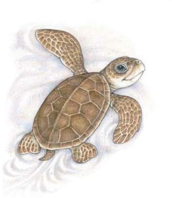
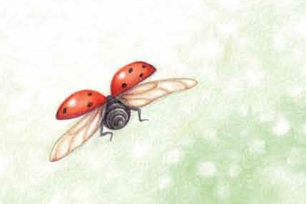
And I like to be as factual as possible. For example, in TJK, the first page describes a butterfly but doesn’t indicate what type of butterfly it is. I could have just made up a generic sort of cartoony butterfly, but since I had to draw one anyway why not make it a real one. I purposely chose an Eastern Black Swallowtail because I liked the way the caterpillar and chrysalis looked. Also, all the plants and flowers shown in the pictures are the kinds of Host Plants and Nectar Plants Eastern Black Swallowtails use.
So, what are some of the favorite things you learned and included in the illustrations?
Oh there are lots of things. I had particular fun with the new butterfly learning to fly because my husband is a pilot, and our daughter took flying lessons, so all those books and charts are based on the things they both used in their training.
On the Horn Shark page I purposely showed the type of food Horn Sharks eat. And I think one of my favorite images is the Angler Fish serving as a nightlight.
For the Ladybug pages – I had no idea a Ladybug goes through so many stages! Illustrator trick short cut – I colored all the stages on the naturalistic page first, then made color copies of the ones I needed, cut them out, and glued them directly onto the leaf-bulletin board art on the anthropomorphic page so each stage would look exactly the same on both spreads.
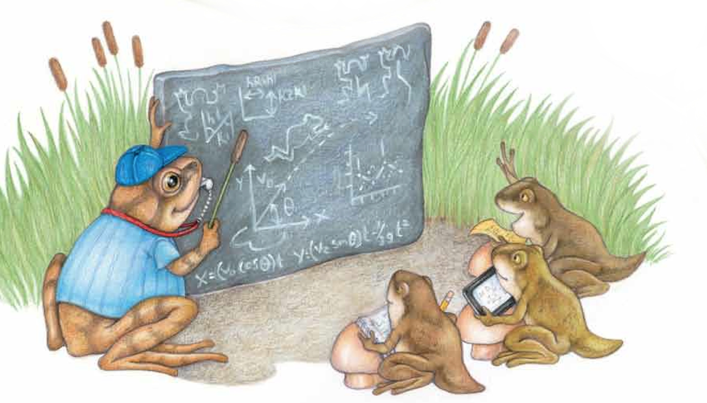
On the Spring Peeper page – that is a real mathematical formula for frog jumping seen on the garden slate blackboard. Well, technically it’s a couple different formulas, I just put them all on the slate. This is my favorite detail in the whole book 🙂
Also I’m particularly fond of the look on the Mom Snake’s face (with her angry tapping “foot”) and the expressions on the two kid snakes. SIDE NOTE: Did you notice they were playing Snakes and Ladders. Ha! Yes, indeed I did!
Laurie, do you have any questions for me? What do illustrators always wish they could ask authors?
I guess my biggest question is – How difficult is it to see your words visually interpreted by a stranger? Is it weird to see characters look different than you imagined when you were writing the story?
When I first started writing this was difficult for me (in all my imaginary books). I used to put ALL sorts of illustrator notes in my manuscripts. I can’t tell you when I stopped feeling this way… it just happened. I did imagine the visual rhythm in THEY JUST KNOW, but I decided that if I controlled the verbal rhythm in the manuscript well enough, that my vision might become yours. And it did!
I guess the follow up would be – Have you ever been completely surprised by the direction an illustrator took? Pleasantly or otherwise?
Yes! I just got to see the cover for my upcoming middle grade novel and I was VERY surprised. The book is about three kids that get into a midnight war with some stinky trike-riding skunks and an army of vicious raccoons (who did you think played on your neighborhood playground all night?). Anyway, the cover doesn’t [TOP SECRET – INFORMATION REDACTED] and the snarly raccoons on the cover? They’re [TOP SECRET – INFORMATION REDACTED]. Those were surprises, but to me they were wonderful ones. It was like the artist peeked into me, not just into the book, to create that cover! We are doing a reveal soon on the Teen Librarian Toolbox blog… I’ll keep you posted!
How do you decide what you want to write about, and the point of view you’re going to take? I ask because my dream is to one day write (and illustrate) a story of my own, but when it comes to the actual writing part I get overwhelmed by all the narrative possibilities. First person, third person, memoir, chapters, picture book, first reader, young adult.
Oooh! What kind of book do you dream of?? Tell me later!
I don’t always consciously decide how I’m going to tell my story. The first thing that comes is a FEELING. I hear a kid say something, or I say something to a kid, and suddenly I can feel this quiet space between words and the story starts to become something real in my mind. THEY JUST KNOW started when my grandmother and daughter were pretending to be a mother and baby butterfly. I said, “Did you know, butterflies never meet their mothers?” My daughter’s eyes went wide, my grandmother made a different sort of face, maybe because I’d spoiled their fun game, and then there was quiet. My daughter waited expectantly for me to explain my audacious claim. That waiting, that wanting to know, is where I think my stories start. I do often explore different points of view and formats, but usually in a revision. When I’m writing I don’t worry about that stuff.
Not to mention, my bigger/biggest problem is – all the subjects that fascinate me. I have notebooks full of plot ideas and character descriptions, even snippets of dialogue, but then can never narrow down my topic. What calls to you first? The subject? The story? The style?
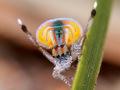
Ha! I do this too. I once wanted to write an entire book of poems about spiders (I love those little creeps so much), but I became overwhelmed with the possibilities. SO MANY AMAZING SPIDERS. I mean, just look at this little guy:
I knew I had to reign myself in, so I decided to write only about spiders that lived in the Sonoran Desert, but then I thought, WHAT ABOUT ALL THE OTHER SONORAN ANIMALS, HUH??? So I had to put them in too and what began as a book about spiders has become a web of interacting poems about snakes and storms and pronghorn and javelina and a few spiders too.
And of course – Do you have a dream project you haven’t tackled yet?
Whatever I’m working on RIGHT NOW is my dream project! I have dreamt of rainbows and rosy boas and spiders, of skunks and raccoons and even little kids. Maybe sometime all of those dreams will become books. 😉
Thanks so much for answering my questions and for asking such amazing ones. I can’t wait until our book gets out there!
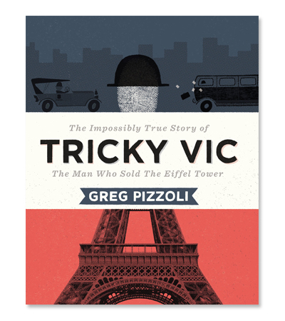
I’m so pleased to welcome Greg Pizzoli to the Nonficiton Nook!
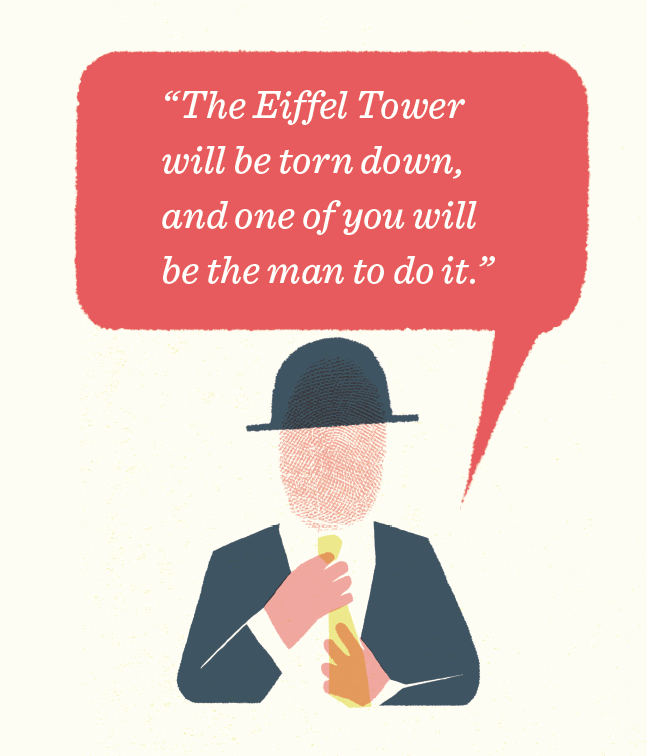
Greg is the Geisel Award winning author and illustrator of funny, spectacularly designed, and visually stunning picture books for very young readers. His first non-fiction picture book, TRICKY VIC, is as slick as his con-artist protagonist. In TRICKY VIC Robert Miller, AKA “Count Victor Lustig,” uses a string of aliases across the world, sells the Eiffel Tower for scrap metal in France, and even cons the infamous Al Capone in Chicago. The sly humor, stunning design, and real world villainy of Robert Miller in TRICKY VIC is sure to thrill young readers.
After reading my interview with Greg, if you still need more convincing, you can sneak a peek at my goodreads review. But if you’ve already been conned, simply add a comment to the interview post to enter to win one of two signed copies of Tricky Vic!
1. Hi Greg! Does your interest in conmen go back to your own childhood? Did you know about Robert Miller before you began to research this book, or did you go hunting for the perfect conman character?
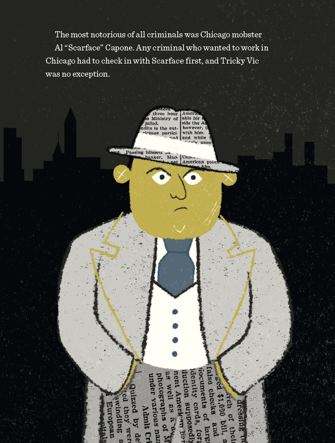
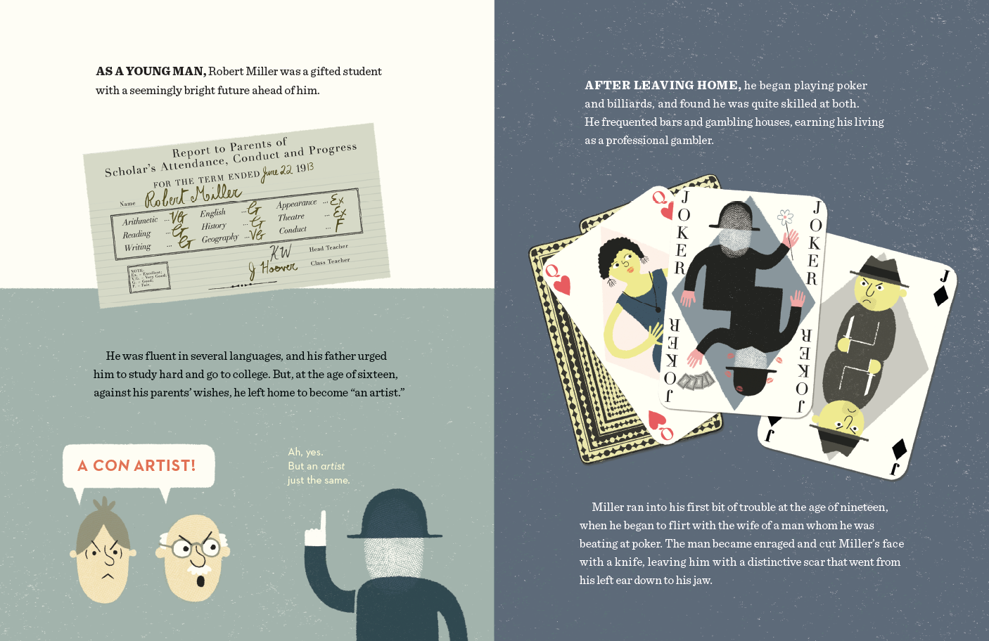
Great question! Like most kids, I was really into the idea of getting away with things. Although I don’t know if I ever even heard the term “con-artist” until high school. But I was always super interested in books that catalogued people like Al Capone, John Dillinger, etc. with a photo and maybe a paragraph about their worst crimes. I ate those up.
I first heard about “Count Victor Lustig” in 2008 or 2009 while in graduate school. I went hunting for nonfiction stories because it seemed like a different kind of challenge than the work I was doing at the time. It took another three years or so and lots of luck before I conned Viking into publishing it. I didn’t find out his real name was Robert Miller until I started researching the book in earnest in 2013.
2. Did you learn anything interesting about Robert Miller that didn’t make it into the book. I’m asking for the grownups in the room. Don’t hold out on us!
The best stuff is in the book! We did very little sanitizing to make the book more “kid-friendly” – a term I despise – and we didn’t hide any of the good stuff.
That being said, some stuff didn’t make it into the book either because the cons weren’t quite as dramatic or the pay-off wasn’t that great. One of the cons we cut was a “trick” where Miller convinced a banker he wanted to buy a bank-owned farm, and through literal sleight-of-hand, switched some envelopes in the banker’s office and walked out with $10,000. That’s impressive to be sure, but it doesn’t showcase the same kind of ingenuity he displayed in his other cons.
I will say that there is a secret* in the book for anyone interested enough to hunt a bit. I think of it as a nice surprise for the readers who really devour the book and want to see Miller from all angles.
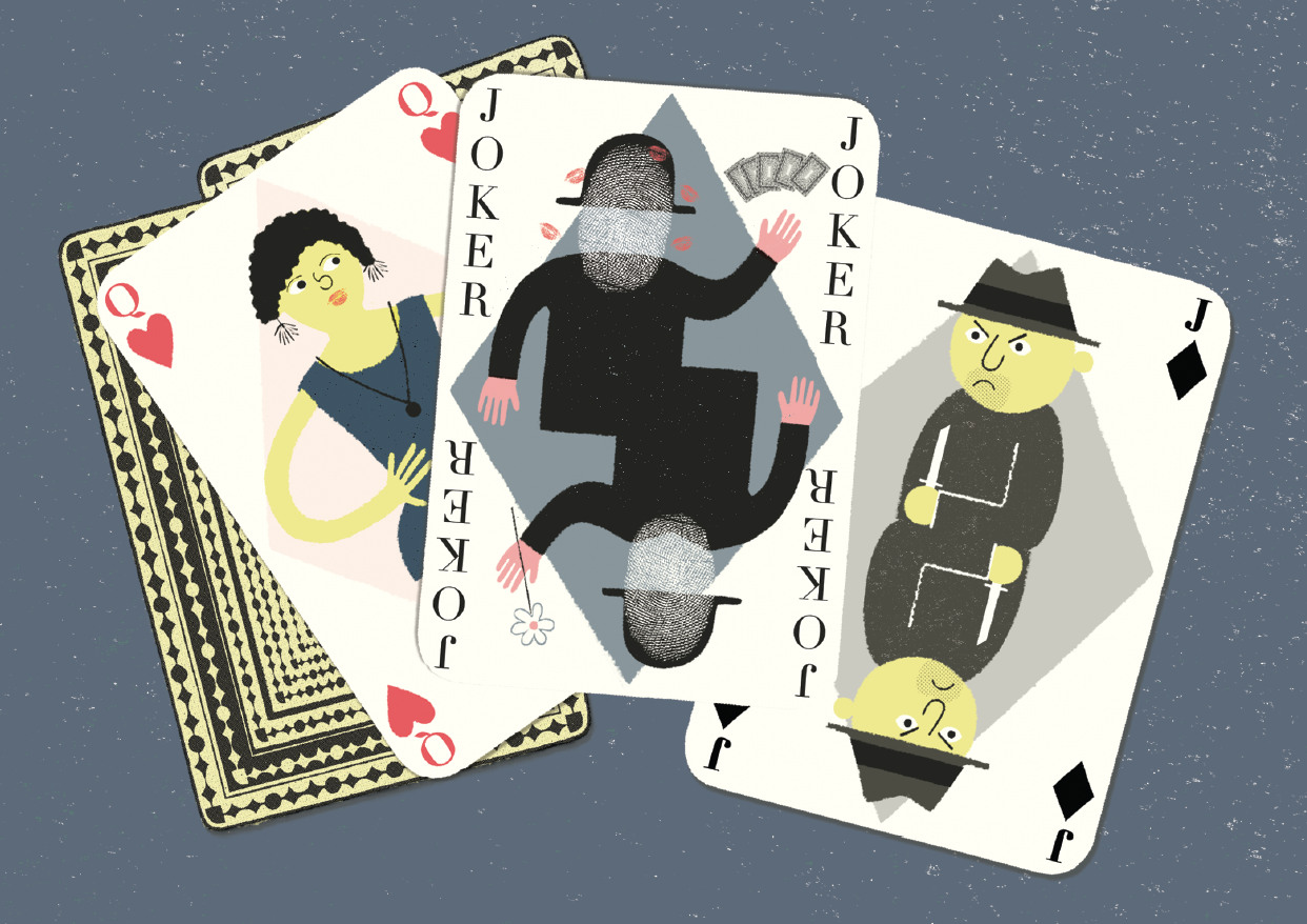
*This is a part of the secret brilliance of Greg’s illustration. The pictures can be read just as deeply as the words. I love the spread (shown below) that illustrates the knife fight, because it displays how the book balances the inclusion of real and uncensored details with interesting (but not gruesome) illustrations.
I think it’s great that you picked out the playing card image as a favorite – it’s one of my favorites, too. I had a lot of fun sneaking small details into this book and I think that image in particular speaks to that – for example, Vic as the “joker” card is pretty obvious maybe, but then having the queen be the woman he’s wooing over the poker table, and the jack being the man who slashed his face. Vic’s holding flowers towards the queen and cards towards the jack. Maybe it’s obvious to some people, maybe some people won’t even notice it, but adding little details makes it a lot more fun for me. Oh! And the lipstick on Vic’s card, too, that’s another example.
3. TRICKY VIC strikes me as the kind of book that kids will pass around among themselves, whisper about, maybe even hide (while we all watch them sideways and smile). Do remember any books like this from your childhood?
I love this question! It would be great if readers thought that reading this book meant that they were getting away with something.
But I have to be honest – while I do remember CDs and video games (with profanity or violence) getting passed around as you describe – I don’t remember any books that weren’t fair game.
4.I think school visits with this book are going to be a lot of fun! Do you have anything tricky up your sleeve? Will you be teaching confidence tricks, sleight of hand, making up aliases?
All of those things! Kids are all (or, ok, mostly) natural cons and tricksters anyway, and it will be fun to engage with them in a way that encourages those tendencies – and maybe help kindle some interest in nonfiction that’s different from what they typically see or read.
5. I know you have another nonfiction title in the works, about a jungle explorer—can you tell me anything interesting about that? Like does anyone get eaten by a jaguar, laid up with a mysterious jungle fever, or get lost FOREVER?
Yes! Thanks! I don’t want to give too much away – but yes, another book is in the works – and it’s about an explorer – there are jaguars, anacondas, and cannibals – I’m working on it now and it will hit shelves later next year.
Voila. There you have it folks.
Tricky Vic & the brilliant con-artist Greg Pizzoli!
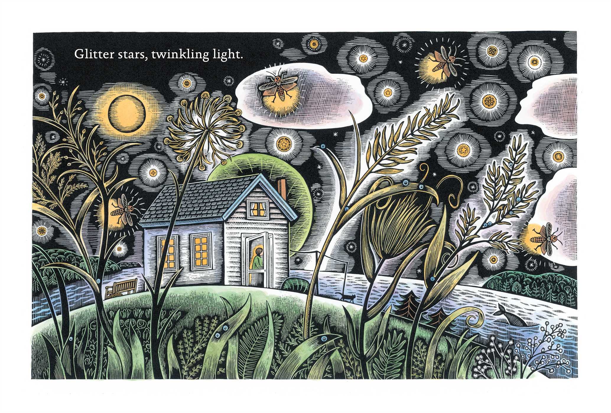
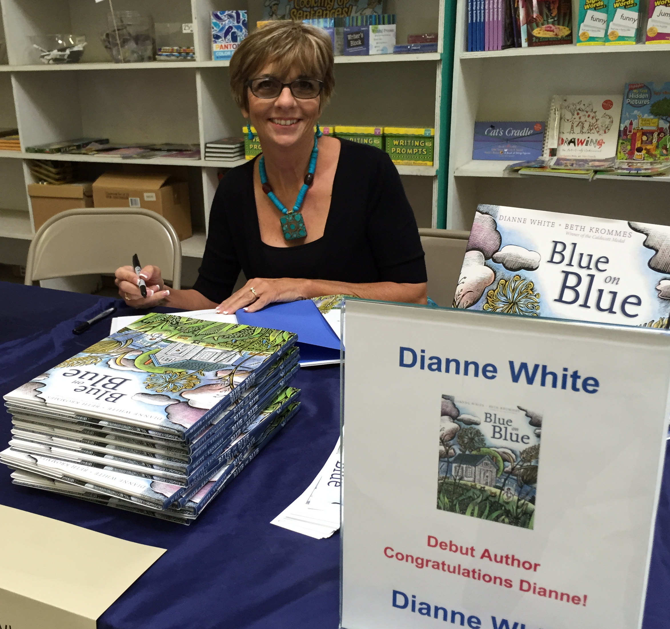
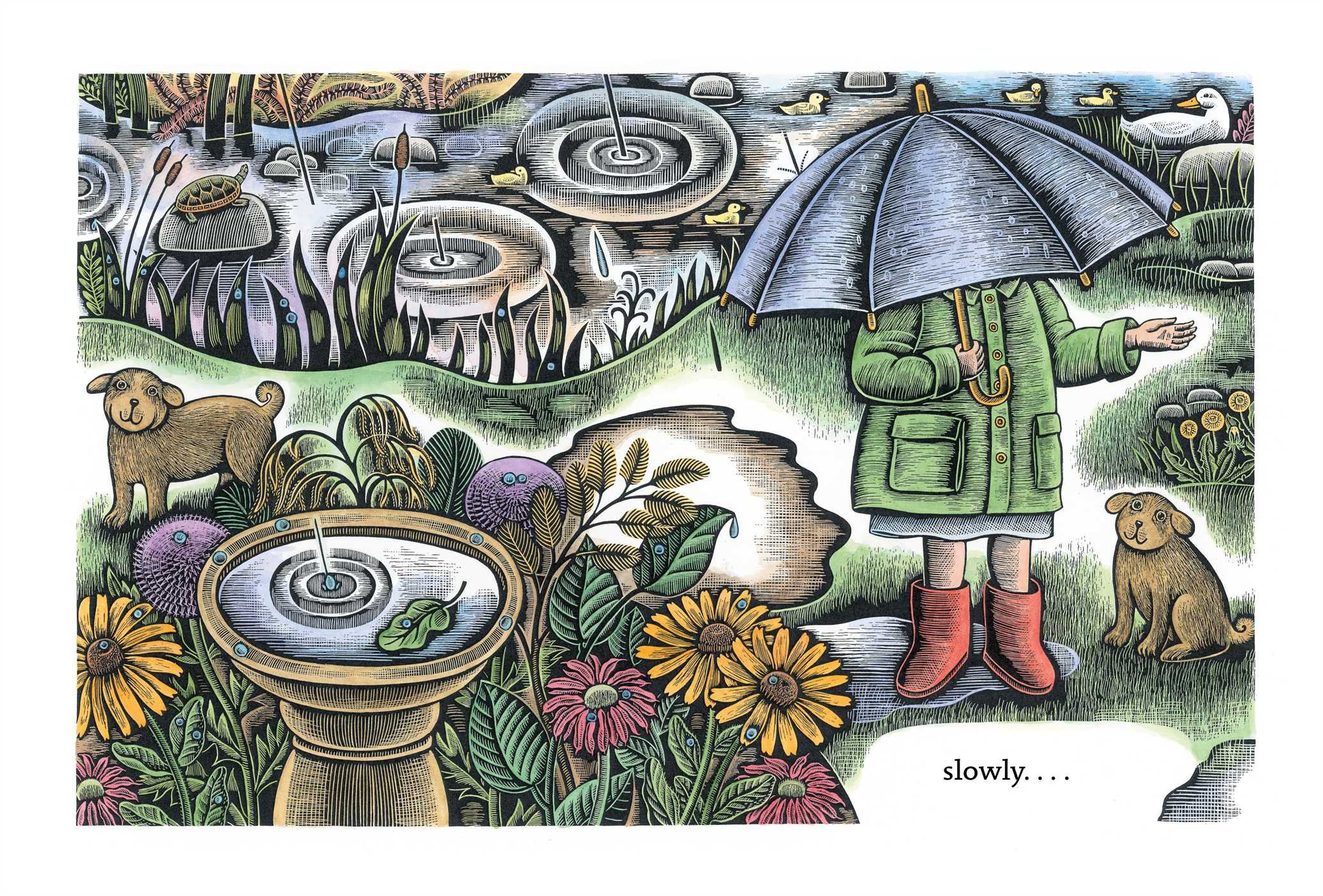
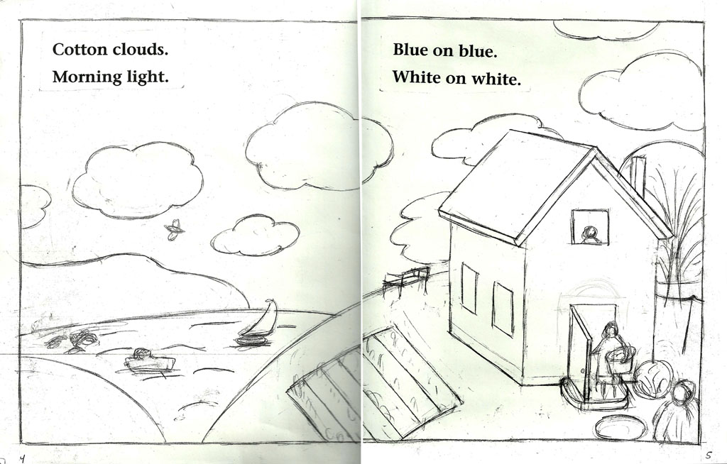
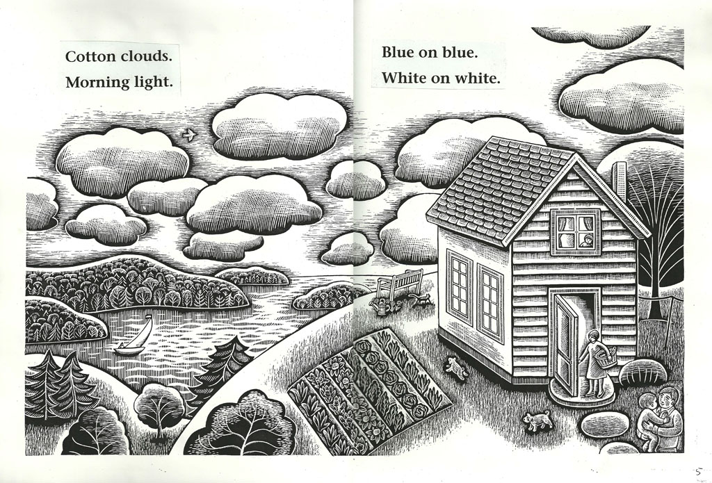
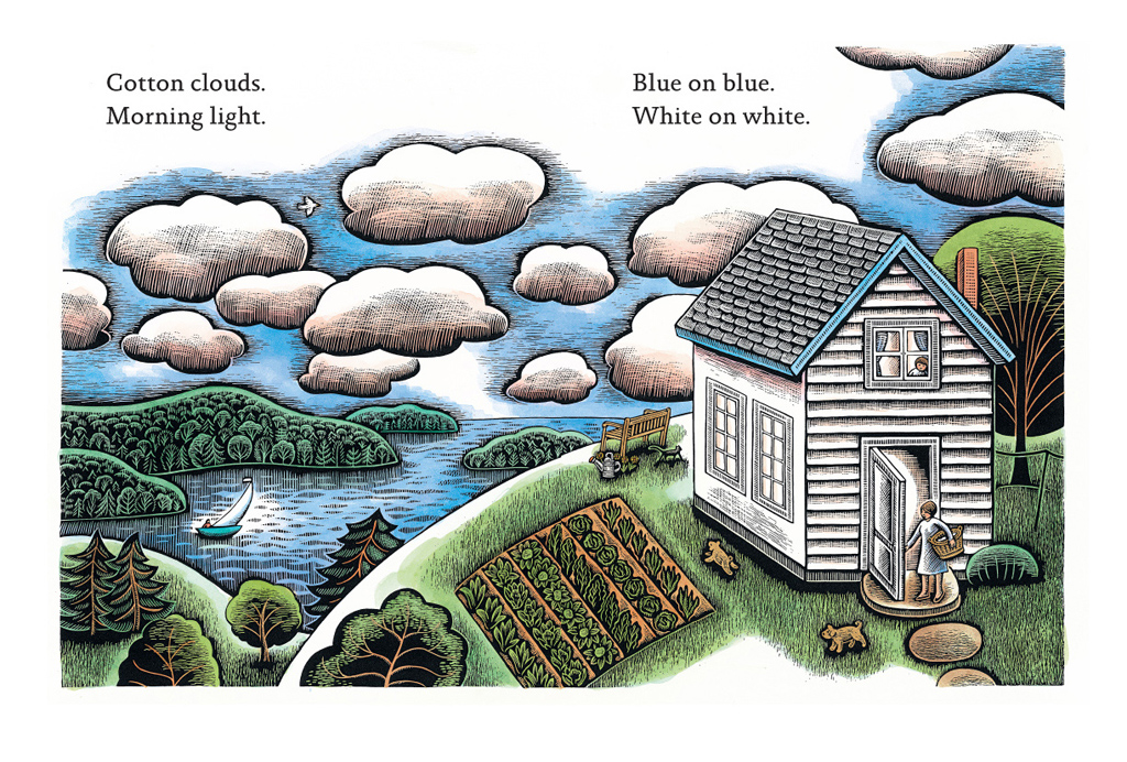
Today I’m posting double interviews with debut picture book author Dianne White & Caldecott medal winning illustrator Beth Krommes. I’ll be giving away two copies of their new book, BLUE ON BLUE, signed by both the author and the artist!*
BLUE ON BLUE is a thing of beauty! Dianne’s graceful and spare poem of a stormy day is the like the sound of rain on a roof, rhythmic, comforting, and thrilling. Beth’s visual world is the earth on which that rain falls. The book, pictures and words together, is a house, a cozy world where family, childhood, and home are connected with the wonder of the natural world.
I was so pleased to ask Beth and Dianne each three questions about BLUE on BLUE and since picture books usually begin with the words, I’ll start with Dianne:
1. Dianne, your perfect little poem only gives the slightest hint of the child’s story in the words “Singing, swinging outdoor play,” but I imagine you had your own visual story of the child’s rainy day. I wonder how much of that you shared with the publisher and how much of what you imagined, but didn’t share, made it, magically, into Beth’s intricate art?
When I write, I often do have some sort of vague image possibilities floating in my head. But in the case of BLUE on BLUE, I don’t recall giving much thought to it because the story came quickly and in its entirety. As such, it wasn’t a manuscript I labored over in the way that I have most others.
In one of my first classes in writing for children years ago, I was told that the author’s job, once a book has been acquired, is to step aside and let the illustrator bring her vision and narrative to the text, and the editor, her wealth of knowledge and experience. So when I got the news that Allyn Johnston of Beach Lane Books wanted to acquire the book, and Beth Krommes would illustrate, I was over the moon. I’d greatly admired the books Allyn had published over the years and I’d been a fan of Beth’s work since I first encountered it in her illustrations of Phyllis Root’s, Grandmother Winter. I knew, on all counts, that BLUE on BLUE had been placed in the very best of hands.
But to answer your question directly – No, I didn’t share thoughts on illustrations. Beth was kind enough to share the initial sketches/dummy of the book once she began working. And of course, they were as wonderful as I knew they would be! But when I saw the final images – ohhh! They were glorious. And the colors! All of my favorites. It was like receiving a most beautiful and exquisite gift.
2. In your words there is a dance between the simple beauty of a child’s experience, of mud and outdoor play, that then expands upward to encompass a more extraordinary appreciation for the natural world. In doing that you link the mundane, earthly beauty of childhood to the twinkling of stars—something quite heavenly. I see this again and again in Beth’s work, and I’m guessing it’s one of the reasons you two were paired on this book. My question is, where do you think that comes from? From where inside you does that spring?
That’s a fascinating observation, and it makes me very happy to know that the connection between the ordinary, mundane things of life with the extraordinary beauty of our world comes across in both words and illustrations. It wasn’t by conscious intention on my part, but it’s something I find myself more and more fascinated by – how amazing our world is and how important it is to pay attention to “small moments” and even smaller things.
3. Would you please share a favorite rainy day memory from your childhood?
One of my favorite memories is of the sound of the rain pounding on the corrugated roof over the indoor garden of our family’s home in the Philippines. It was loud and exciting, and echoed throughout the entire house! More recently, in Arizona, we’ve experienced pounding, hounding, noisy-sounding thunderstorms such as we’d never known for all the years we spent in Southern California. These sudden bursts blow over fairly quickly, but I still find myself fascinated, and often stand on the patio or porch taking photos and video.
Thank you, Dianne & happy first book birthday!
Now it’s Beth’s turn:
1. Beth, when you read Dianne’s poem how much of the visual story came quickly, and how much was developed over a longer period? When my son and I read this book we spent time finding his favorite things: the kitties, the turtles, the tractors. Do you put those little spot illustrations in instinctively, or have you learned what children love to hunt for over the course of your career?
I wrote at least six pages of notes after reading Dianne’s manuscript, dissecting every word of the text. For example, I wrote down “cotton”, then listed everything I could think of about cotton: plant, white, fluffy, shirts, sheets, white laundry on a line, etc. After analyzing each word, I wondered who needs to watch the weather? Pilots, sailors, farmers. I thought about what kind of animals might react in advance to a storm. Dogs, birds, horses, among others. Who likes to play in the mud? Children, dogs, ducks, pigs. Who doesn’t like mud? Parents, farmers. I thought about everything to do with water: the journey from rain to sea, sheets of rain, ocean, river, stream, raindrops, faucet, tub, pitcher, baptism, bathing, drinking, cooking, cleaning, reflections, etc. After tons of brainstorming, the characters and setting started to come into focus for me.
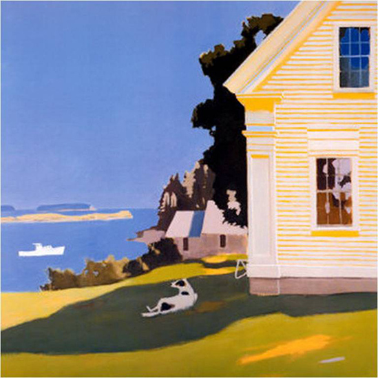
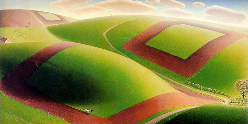
I looked at the work of two of my favorite artists for inspiration: Fairfield Porter, especially his painting “Island Farmhouse”, and Grant Wood for his painting “Spring Turning”.
I’ve been told many times by parents that their children love to hunt for things in my pictures, so I always include lots of fun details, especially animals.
2. Over and over again in your art I notice that same sensitivity that is present in Dianne’s poem, that ability to link the experience of childhood, the earthly acts reading, playing, and snuggling, with an expansive, birds-eye wonderment of the natural world. So where you think that comes from inside you? From a person, an experience, a place…
I’m not sure where that comes from. I’m from a Lutheran family and have attended church for most of my life. I love to ponder the beauty and mystery of the world. I’m also an art lover. Museums are holy places to me.
3. Would you please share a favorite rainy day memory from your childhood?
I have many cozy memories of watching rainstorms from a safe place indoors, such as through a screen door. My best mud memory, though, is when my friend Ann lost one of her brand new penny loafers the day before fifth grade started, when we climbed a huge mud mountain in the construction site behind her house. That shoe was sucked right off her foot, never to be found again. It was the darndest thing.
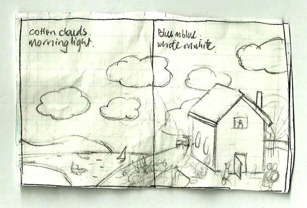
Beth was kind enough to send along some process pictures which show the transformation from tiny thumbnails, to finished sketches, to scratchboard, to the final full-color art!
*The BLUE ON BLUE book giveaway contest is closed!*
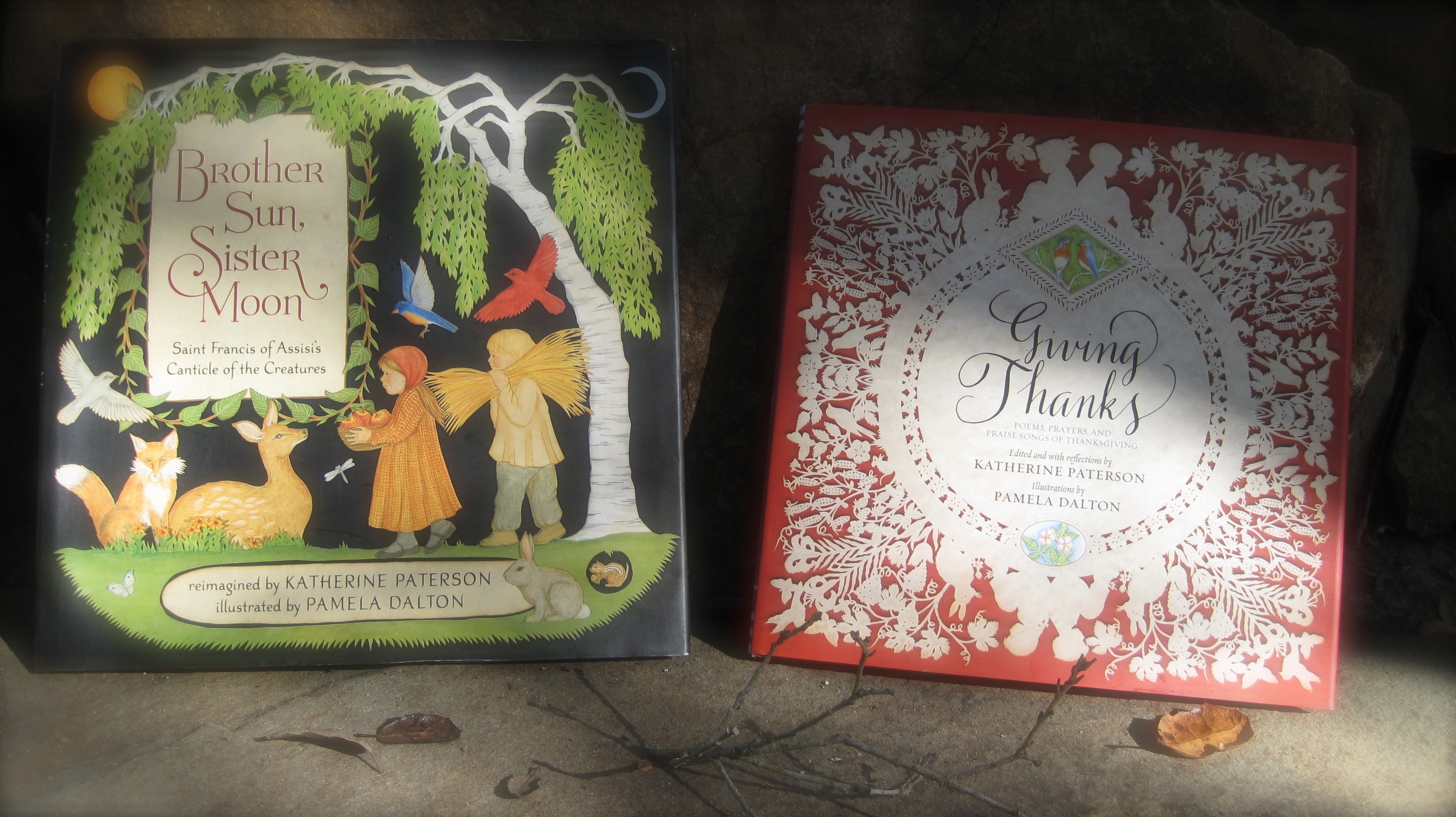
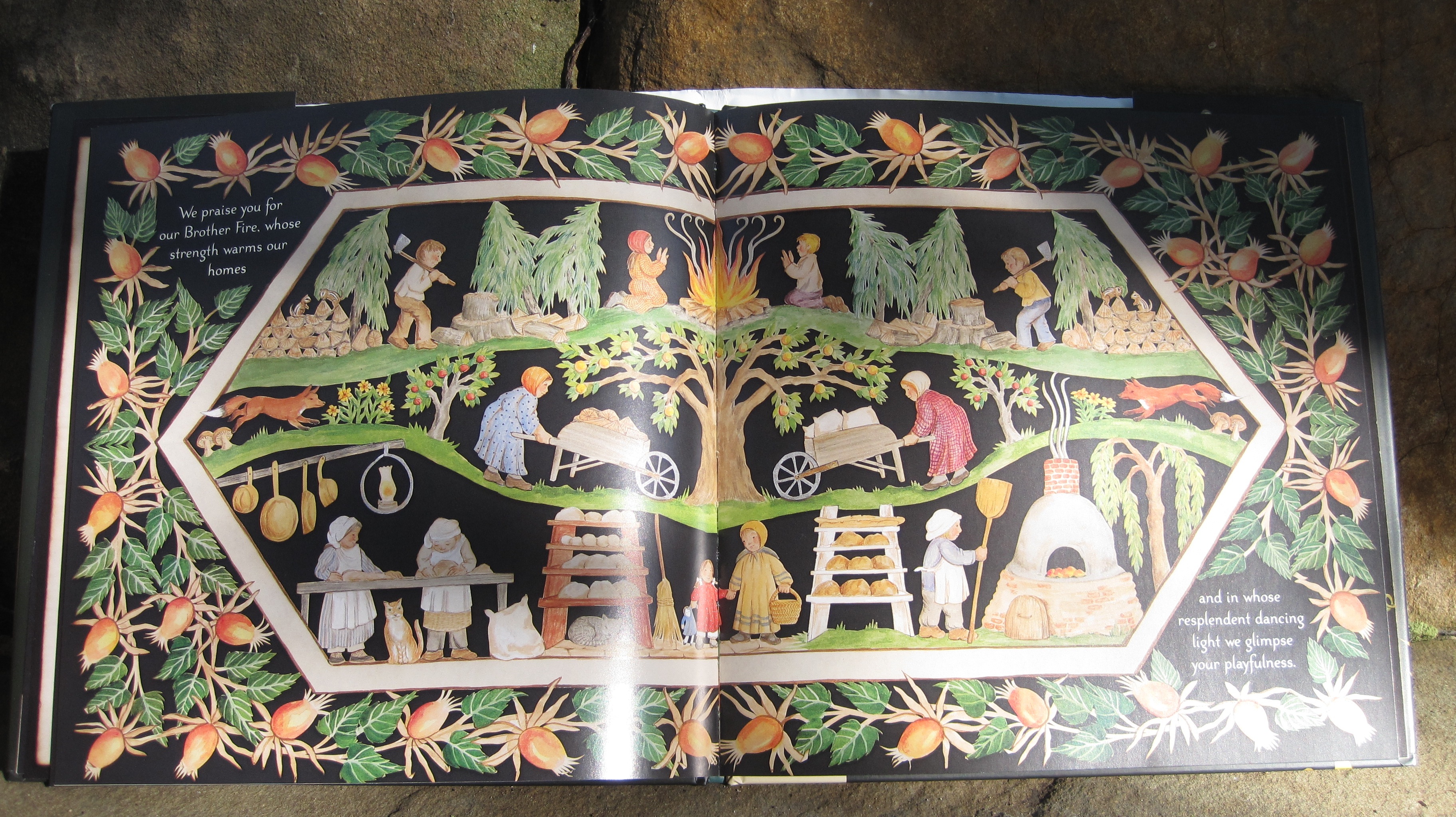
Hi everybody, today I’m posting my interview with illustrator and cut paper artist, Pamela Dalton. To illustrate her books Pamela uses endless exacto knives to create intricately beautiful Scherenschnitte, which she stains with coffee and paints with watercolor. BROTHER SUN, SISTER MOON is a special favorite in our house. In it Katherine Paterson has reimagined Saint Francis’ Canticle of the Creatures and Pamela has created a world of beauty to revel in. Their newest book, GIVING THANKS, is a collection of poems, prayers, and praise songs of thanksgiving. It glows gently with gratitude. Go ahead and read the interview with Pamela, and if you want a signed copy of your own please enter the contest in the comment section!***Book Giveaway Details Below***
1. Hi, Pamela! What do you think kids would love to know about you?
I would say, that the pictures of BROTHER SUN, SISTER MOON are not a whole lot unlike where I live. I’m way out in the country. I live in an amazing community. We do a lot of things the old timey way. The bread oven and the section on fire, stands right across the road from my house. There is a big dairy barn with forty-some beautiful brown Swiss cows, also directly across from the house. Yeah… and we have our wood stoves, and we all have our gardens, and all walk in the woods, and it’s just like the picture book!
2. I have the new book, GIVING THANKS. It’s really different, from BROTHER SUN, SISTER MOON. How do you decide what you want a book to look like?
That was really the vision of my editor, Christopher Franceschelli. He really wanted to do a book of prayers and graces, with the theme of gratitude. He envisioned using the color instead of the black, he envisioned the white on white, stuff that I would probably never do in a million years, but I’m thrilled with how it turned out. Especially the white on white! (It looks, to me, like a tablecloth.)Yeah, It just looks very elegant to me!
3. Do you have a favorite piece in the book?
My favorite prayer is the Albert Schweitzer, and my favorite image is the little sitting mouse that goes with that, or in that section. I just have an infinite love for animals, and I really loved painting that little mouse! I just felt so good painting that little mouse and I think that particular prayer is so meaningful and so precious to me. I wanted to give it an exclamation!
Well, here it is:O heavenly Father, protect and bless all things that have breath: guard them from all evil, and let them sleep in peace.
4. When you were little did you make cut paper dolls and snowflakes or was that something you learned to do as an adult?
I made a lot of snowflakes!
I think you should make a book about snow! That would be beautiful.
Right now I’m working on a set of Christmas ornaments, they are scenes from my village, and they’ll be ready for NEXT Christmas! Then we’ll be on to the next book…
I can’t wait, Pamela. Thank you so much! (Pamela’s forthcoming book, UNDER THE SILVER MOON, will be a traditional collection of lullabies, night songs, and poems!)
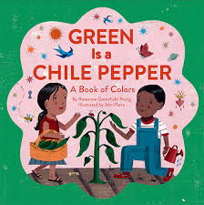
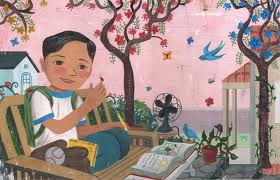
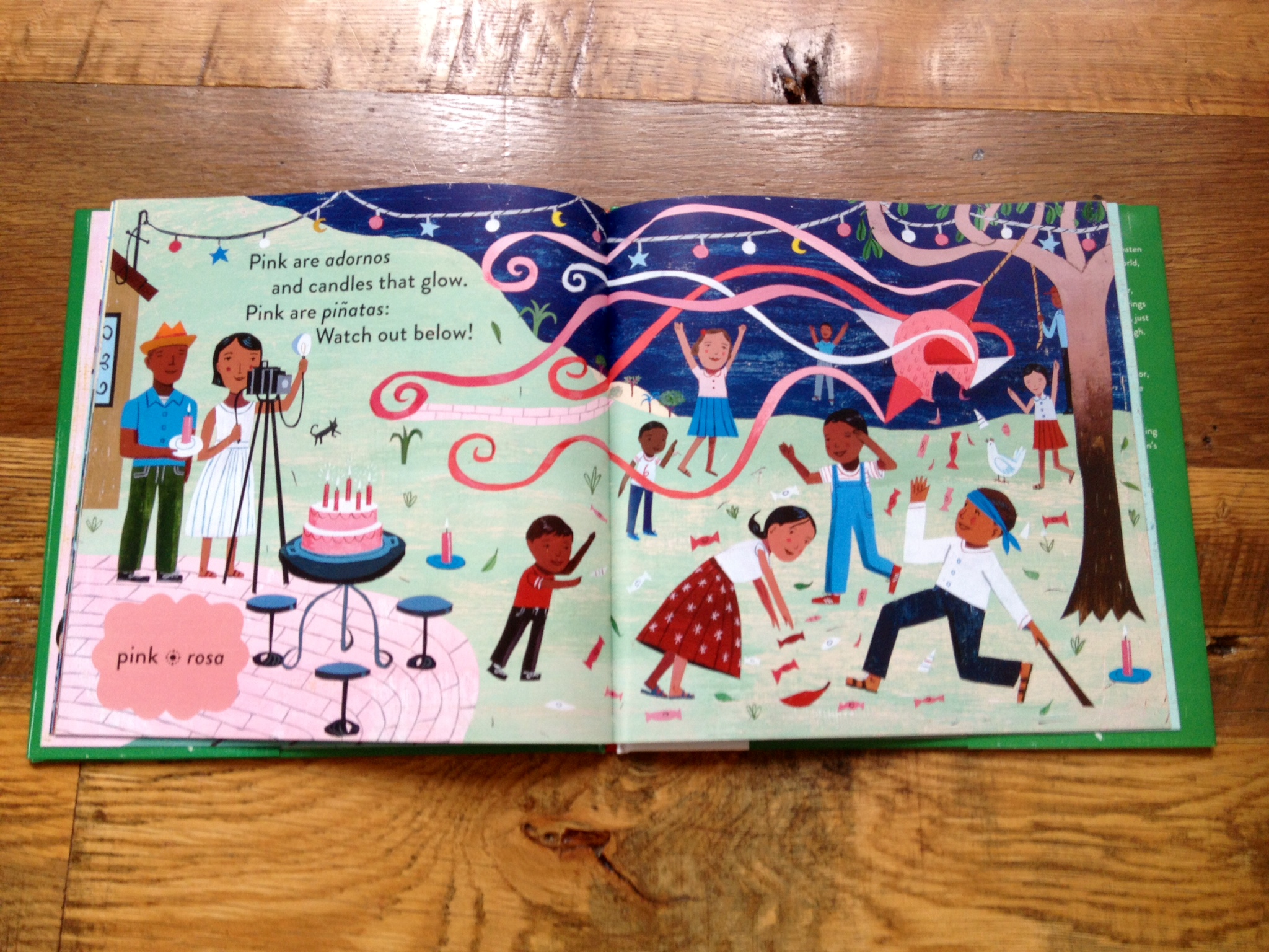
To celebrate my interview with illustrator John Parra I’m giving away a signed copy of his newest book, GREEN IS A CHILE PEPPER. I am such a sucker for color concept books and this one is MAGIC! It is beautiful, it has heart, and it invites readers to SEE the world, to look, to feel, to listen, to smell, to taste, and to have fun! Roseanne Greenfield Thong’s simple verse is sprinkled with Spanish, which absolutely enriches the experience of reading this book. GREEN IS A CHILE PEPPER will call to all your senses and will be wonderful to share in a classroom, a library, or on a lap.
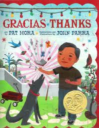
John Parra is an award winning illustrator best known for his illustrated Latino themed children’s books, Gracias / Thanks and Waiting for the Biblioburro. His books have won him The Golden Kite Award from The Society of Children’s Book Writers and Illustrators, and The Pura Belpré Honor’s Award from The American Library Association.
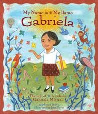
I first picked his books up at the SCBWI Summer Conference. I kinda fell in love with his art–I bought GRACIAS/THANKS and MY NAME IS GABRIELA. I knew John would be signing books at the autograph party at the end of the conference, but I wasn’t going to be able to stay. So even though I don’t illustrate my books I went to one of his workshops. He talked about his inspiration and his illustration process. He shared cool pictures from his childhood. It was one of those great moments in life when you KNOW you are in the right place, doing the right thing, and you KNOW why something affected you the way it did.
About two minutes into the workshop he started talking about one of the biggest influences on his art: growing up in Santa Barbara. He shared pictures of Old Spanish Days, Piñatas, and lights strung from trees. Santa Barbara is my city, you guys. It is color. It is home. It inspires me too.
After his presentation I chatted John up and got him to sign some books for my students in Santa Barbara (back then I was teaching elementary school). Now, whenever I go into schools to teach writing I still share them. He was incredibly encouraging to me, as a writer. Since then I’ve sold my first picture book manuscript and hope there will be many more to come. I think the SCBWI and John Parra had a little bit to do with my process, my inspiration, and my success. So, gracias/thanks and welcome, John!
ROBIN: Well, I have a bunch of your books, not just Green is a Chile Pepper and what I love about all of them is the visual peek you give inside the characters, not just into their bustling lives and houses and families, but into their busy minds and hearts. All your spreads are jam packed with details and they make me wonder, when you create your art is it like a story? Do you know where everyone is going and why all those little details are there?
JOHN: Much of my art is inspired by my childhood growing up in Santa Barbara. One of my inspirations and favorite places to visit as a kid was the Natural History Museum. I loved all the nature dioramas with their detailed environments. Within each display you could find multiple levels of biodiversity to examine, from large mammals, to small birds and insects, and even plants and flora all set to a beautifully painted backdrop mural. I often think of my paintings as one of these dioramas. We live in a world that has so many levels that exist all around us, interconnecting at all times. There are stories and life in these details and that is what I want to show.*
ROBIN: When you go into schools what do kids always ask you about this book (or about your art in general), and what do you love telling them that they never ask?
JOHN: The most frequent question I get is: “Where do your ideas come from?” I gladly tell them that many ideas for my art come from my family, music, food, travel, museums, paintings, gardens, people watching, hiking, old movies, animals, and nature, but one of the most important influences comes from reading, because reading always inspires me to think visually and creatively. It is a successful recipe for creating good art and ideas.
The question I don’t usually get asked, that I think is important, is: “How long does it take to create the art for a children’s book?” to which the kids usually respond “TWO DAYS!” or there about. They are always a little shocked when I tell them it’s closer to seven to nine months of hard work in my studio.
ROBIN: This book is about color, which I’m such a sucker for; when you were creating the art did you start seeing colors around you in a different way or do you always pay attention to color?
JOHN: I’m not sure if I started seeing colors differently while working on Green is the Chile Pepper but I did have to approach my work in a alternate way. As an artist I tend to l use colors from a wide and diverse spectrum. Since each page in this book had a thematic color assigned to it I wanted to keep the focus as much as possible on that one color. One way to do that was to devise a very narrow color palate scheme for every spread, to complement the main color and help promote its significance. Then I searched to find items and images, associated with that color, to incorporate into the image. One example I used for inspiration regarding a color connection had to do with orange. A favorite TV episode growing up during Halloween was special titled: Peanuts: It’s the Great Pumpkin Charlie Brown. There is a scene with a field of pumpkins that I just had to incorporate in that orange, Dia de los Muertos Parade spread. Other color items ideas came from my home, journeys and research.
ROBIN: Do you have a special color you remember from being a kid? (I had a big purple umbrella and since I’m from SB too you know I hardly ever got to use it… but when I did. Oh, PURPLE—I can hear the patter of raindrops on purple now!)
JOHN: Green was my favorite color when I was young (still is). I would find it everywhere, in nature and at home. I use to love to use green when I drew with my big box of Crayola crayons. There was even a restaurant in Solvang, CA called Pea Soup Anderson that would specifically give kids green crayons based on their famous green pea soup. Another reason was I use to also watch a show called Super-Friends on Saturday morning and two of the superheroes I admired the most had green in their names: Green Lantern and Green Arrow. Yep, GREEN was definitely a big influence.
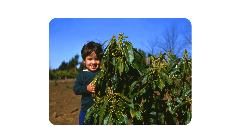
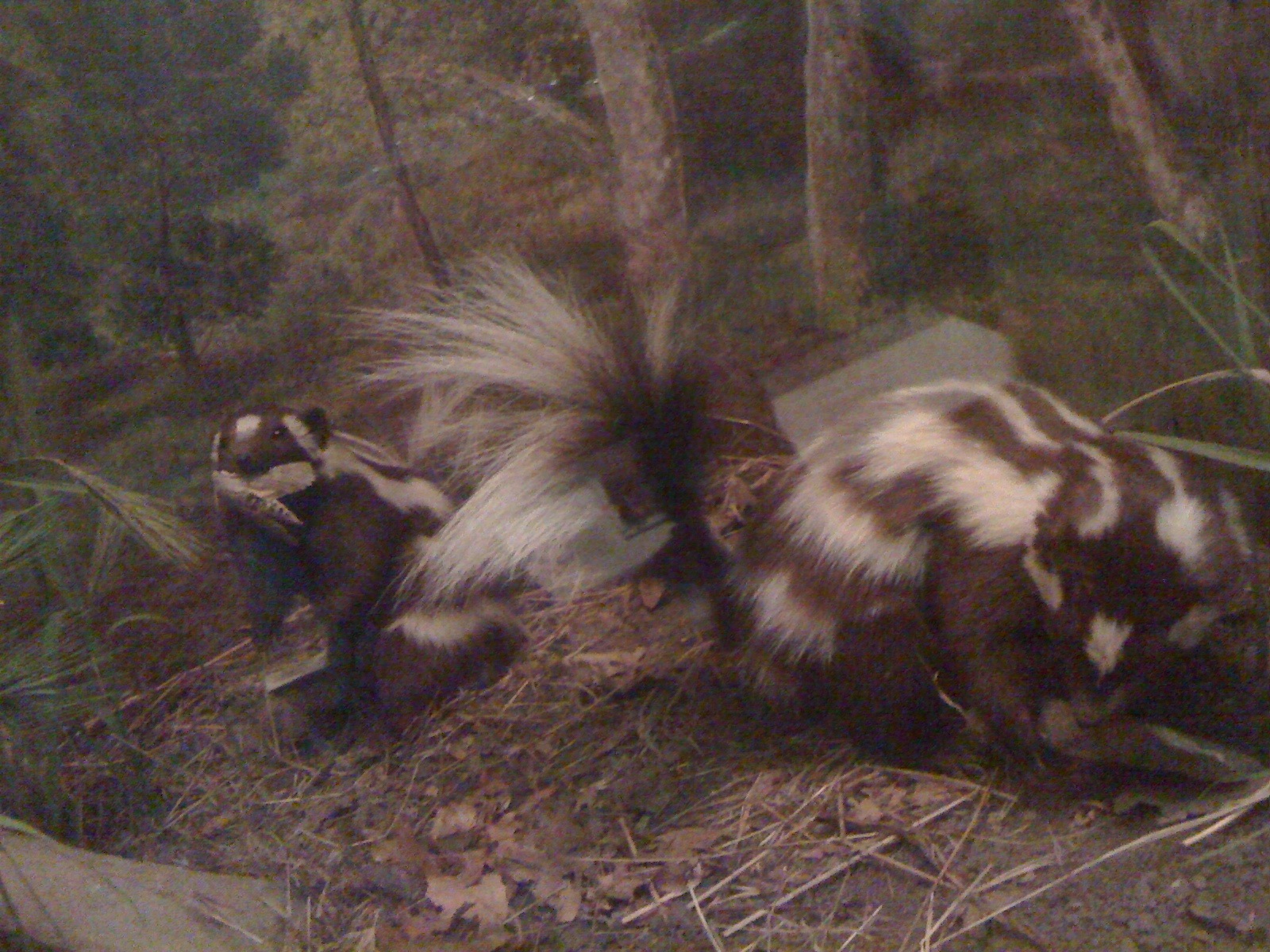
*So, for you guys at home, when I read this answer—John and I were emailing—it was another one of THOSE moments. I went to the Natural History Museum EVERY DAY after school (I snuck in the back—don’t tell) to look at those same dioramas, and now I go a couple times a week with my kids (we go in the front door). My first book is about butterflies, and horn sharks, and a bunch of other animals, and it absolutely started at the museum. I still get inspired there. Right now I’m working on something inspired by these two little guys. They’re spotted skunks. They can do handstands. FOR REAL!*
Early in the morning on July 2, 2014, the Orbiting Carbon Observatory-2 was launched into space from Vandenberg AFB on a Delta-II rocket. It made its 30-second launch window, achieved separation, went into polar orbit, and deployed its solar arrays. And I got to be there, or pretty close anyway.
To celebrate my viewing of the #OCO2 launch I put together a list of some of my favorite recent nonfiction picture books that call young readers to look UP into space… and keep them thinking down to EARTH! Check out my video of the titles: THE HOUSE IN THE NIGHT, THE EARTH BOOK (Todd Parr will be sending the winner a SIGNED copy!), STARS, LOOK UP, & MOONSHOT. If you or your library would like to enter to win one of the featured titles just post your favorite Earth or Aerospace fact in the comments down below, and go ahead and let me know which title you are interested in! I’ll pick the winners on Friday, July 18th!
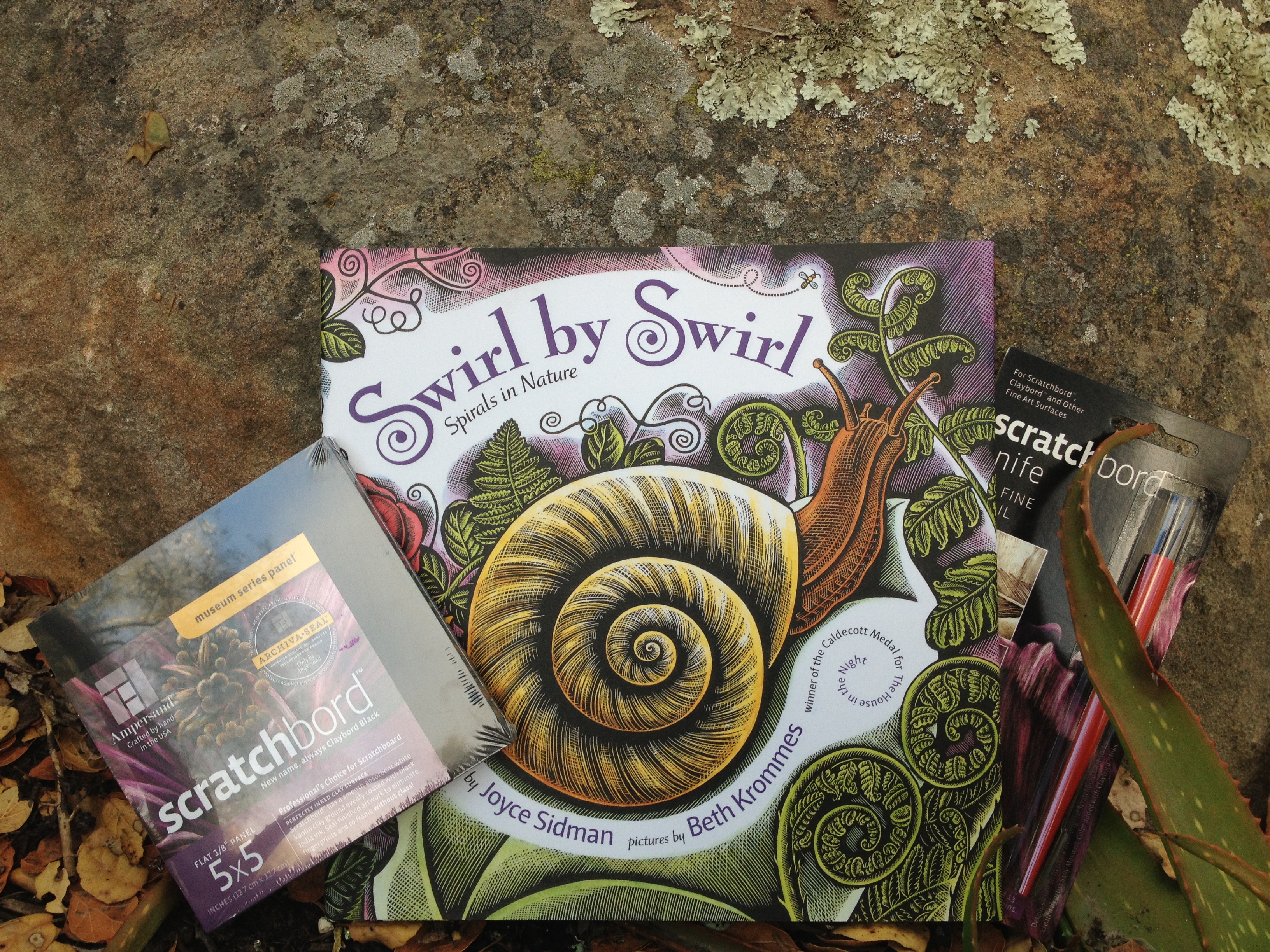
Today I’m posting my interview with Beth Krommes, whose beautiful scratchboard illustrations won her a Caldecott Medal for The House in the Night. Beth’s most recent book with Joyce Sidman, Swirl by Swirl: Spirals in Nature, is a breathtaking view of the natural world, a poem that begins with one word and spins around itself into a spiral. It will send you searching for spirals everywhere you go.
***BOOK GIVEAWAY DETAILS*** I’ll be giving away a beautiful copy of the book along with a scratchboard set for any young artist itching to try their hand at her style! All you have to do to enter to win is let me know what your favorite swirl is in the comments section, or send me a message on Facebook by Sunday, April 20th! ***BOOK GIVEAWAY DETAILS***
1. Hi, Beth! When I told my daughter we could ask you ANYTHING, she quickly asked for “any tips, like for drawing really well, because I don’t.” I think she draws beautifully, but DO you have any tips for drawing really well?
I was in 3rd grade when I discovered that I liked to draw. My parents bought me a drawing book of pencil sketches of horses, and a drawing pad and pencils. I spent hours laying on top of the pool table in the basement copying the drawings from the book onto my sketch pad. Copying other people’s pictures is a good way to train your eye to really look hard at something and to try to duplicate the technique that the artist used.
2. My daughter particularly noticed and liked that you use lots of overlapping. How did you learn to do that?
I don’t just draw out of my head when I have to draw a realistic picture of a certain kind of plant or animal, like in “Swirl by Swirl.” I collect reference pictures from library books and images from the internet. When I need to design a picture like the endpapers on “Swirl by Swirl”, I spread all of my reference pictures out in front of me on my drawing table and just start loosely sketching on a large sheet of paper, overlapping the plants and animals. I use my eraser A LOT to change my mind about where something should go. I also start over about three or four times. I have a very full waste-paper bastket at the end of the day.
I work out all of the pictures for a book in detail in pencil before I begin the scratchboard. If you go to the homepage on my website, wwwbethkrommes.com, and read the interview “Seven Impossible Things Before Breakfast”, you will learn much more about the stages of designing a picture book.
3. Do you ever make mistakes, and if you do, do you start over, or work around them?
It is hard to correct mistakes on the scratchboard. If I haven’t scratched too deeply, sometimes I can re-ink over the mistakes and try scratching the picture again. But I often have to start the whole picture over. There is a big picture of a walrus and a hunter in my book “The Lamp, the Ice, and the Boat Called Fish” that I did over seven times.
If I have a difficult face to draw on scratchboard, I’ll always do several trials on a small scrap piece of scratchboard first.
4. Sometimes you use lots of color, sometimes just black and white. Why?
An illustrator will do what the text demands. “The House in the Night” was a story about night, so black and white was the way to go. It was the brilliant idea of my editor, Ann Rider, to add the golden highlights to give more zip to the pictures.
“Swirl by Swirl” had to have full color because of all of the plants and animals. I prefer to work in black and white because of my background as a printmaker, but am becoming more comfortable with color the more I work with it.
5. Do you have a favorite swirl from the book, and do you have a favorite swirl that is not in the book?
My favorite pictures in “Swirl by Swirl” are the ocean wave and the tornado. I can’t think of a favorite swirl that is not in the book.
6. Even though the book came out two years ago, do you still see swirls everywhere you look?
I have always been fascinated with the spiral shape and I do see swirls everywhere! I am very proud of “Swirl by Swirl”, because I iniated the project before Joyce Sidman came on board as the author. The idea for the book came from a bunch of puzzles I was designing. I noticed all of the designs included spirals. I thought perhaps I could take some of those puzzle designs and turn them into a pre-school shape book about spirals. Ann Rider, my editor, wanted to see a book about spirals in nature–why things in nature are shaped like spirals. I tried to do the writing myself, but it was terrible. Joyce Sidman, also a spiral lover, heard I was working on this project and asked if we could collaborate. I said YES!!!!!! I sent her all of my sketches and notes, and she came up with the text. I had to revamp my sketches considerably, but was thrilled with the structure that her beautiful poetic text gave to the book.
7. I heard your next book, BLUE ON BLUE, is coming in fall of 2014. What kinds of beautiful blues will we get to see when it comes?
It is essentially a book about a rainstorm. It is a lovely simple text, and it was fun to come up with the story told through the pictures. You will see lots of blue in the sky and water.
Thank you, Beth, for coming on the blog today! I can’t wait for BLUE ON BLUE and whatever beautiful book is coming after!
❤ Robin
***BOOK GIVEAWAY DETAILS*** I’ll be giving away a beautiful copy of the book along with a scratchboard set for any young artist itching to try their hand at her style! All you have to do to enter to win is let me know what your favorite swirl is in the comments section, or send me a message on Facebook by Sunday, April 20th! ***BOOK GIVEAWAY DETAILS***
Today I’m posting my interview with Alexis O’Neil, one of my favorite picture book people! Writers, readers, librarians, and teachers all love her. She’s our Southern California school visit expert and an SCBWI Emeritus Regional Advisor! Her blog, School Visit Experts, guides writers and illustrators in developing meaningful, memorable, and fun school visits, helping them to develop their own fan base. She’s loud, she’s fun, and she’s fabulous! Here we go…
1. Hi Alexis, at my house we love your book, Loud Emily, but shhh — this blog is just for nonfiction. So, very quietly, can you tell us one FACT you uncovered while writing Loud Emily?
I had to uncover LOTS of facts for this tall tale adventure. For example, I looked at a map of where wealthy merchants and sea captains might have lived in New Bedford, Massachusetts to determine if Emily could have walked down to Front Street fairly easily. I also studied whale migration. There’s a line in the book that reads, “They [the whales] hastened from Baja, they raced down from Iceland, they speeded their way from the tip of Cape Horn.” These are all real migration routes. I found books with authentic sailing language and used phrases liberally. (This, by the way, is one of the reasons that Mystic Seaport Museum in Connecticut loves my book!) Also, the end papers have bit of actual sea chanties sung by sailors in the 19th century (and even today). At the end of the book, the illustrator Nancy Carpenter and I both included historical notes. So, as you can see, there’s a need for research even in fictional stories!
2. The Kite that Bridged Two Nations is about a boy who gets to be a part of building a great bridge, which I think is such a powerful fact to share with kids. What do kids ask you when you tell them the story? I kind of wonder, do they tell you about their own accomplishments?
I think that this would be wonderful to do – thanks for the suggestion! What I do want kids to know is that an ordinary boy, Homan Walsh, earned an extraordinary place in American and Canadian history by doing what he loved to do. For him it happened to be flying kites. But I hope this book inspires kids to think about what they know how to do well – or want to learn how to do well – and persist at that skill until they feel confident.
3. So I know you are a school visit expert. I feel like you must have quite a roadshow. Have you done many visits for the new book? What’s your act like?
Roadshow? Love that image! All I need is a bus, roadies and a country song!
Since the Kite book came out in September, I’ve been doing all different kinds of presentations: school visits, family fest events, social club talks, bookstore appearances, library programs, conference sessions, TV interviews and more. Each presentation is tailored to a particular audience’s needs, but I use many of the same set of props and images to help me tell the story. That presentation “story” might be about Homan Walsh himself (the kite flier), or about how the book came to be written, or how to use research skills to find and shape a story’s “voice.” And I always try to bring someone up out of the audience to become my main character which I do by dressing him in a cap and scarf and then handing him his kite, Union. This 3-D treatment helps make the presentation memorable.